Dinamo Detective™ Quality Assurance Designer Documentation
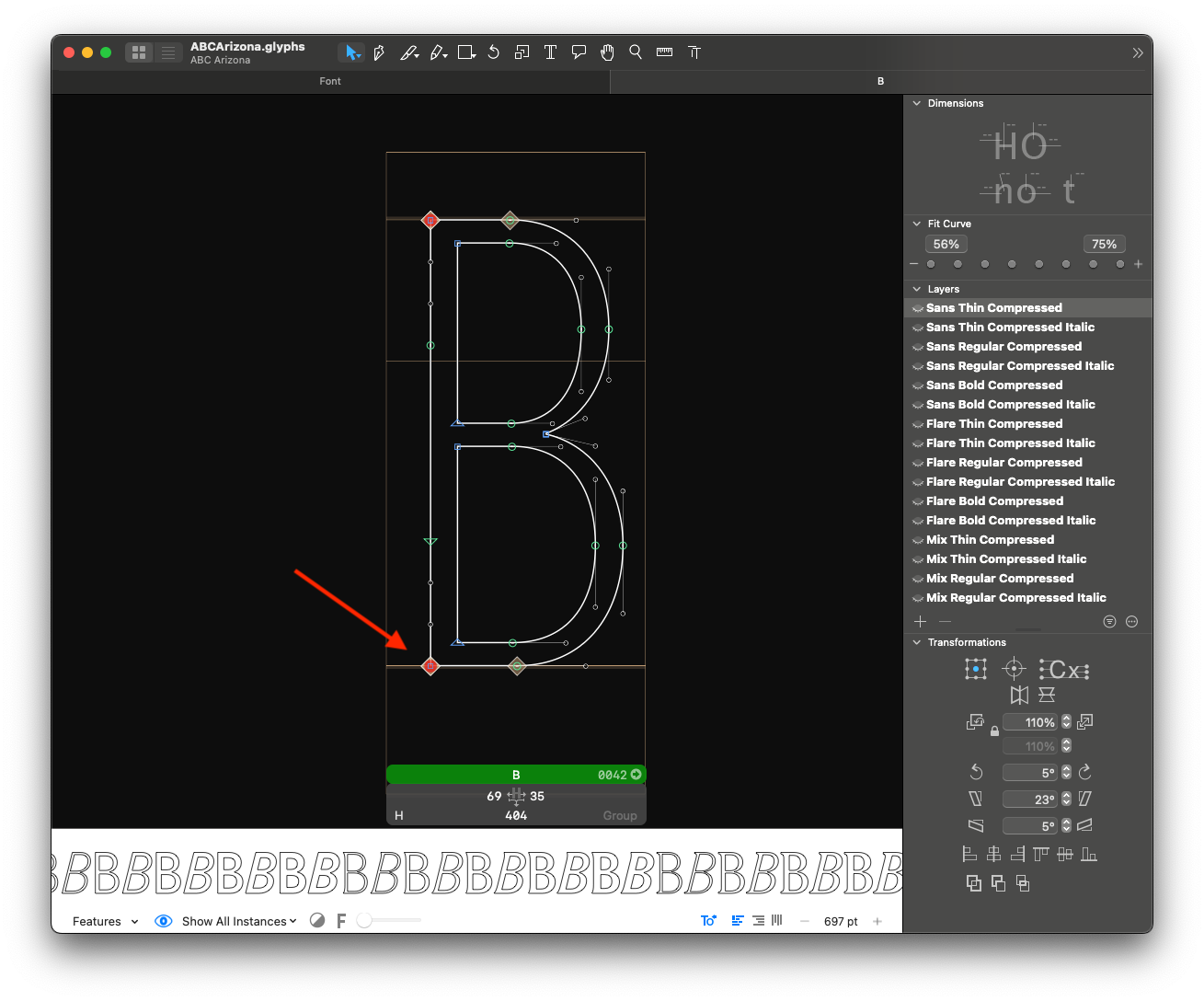
Almost Straight Segments outlines warning
How the check works:
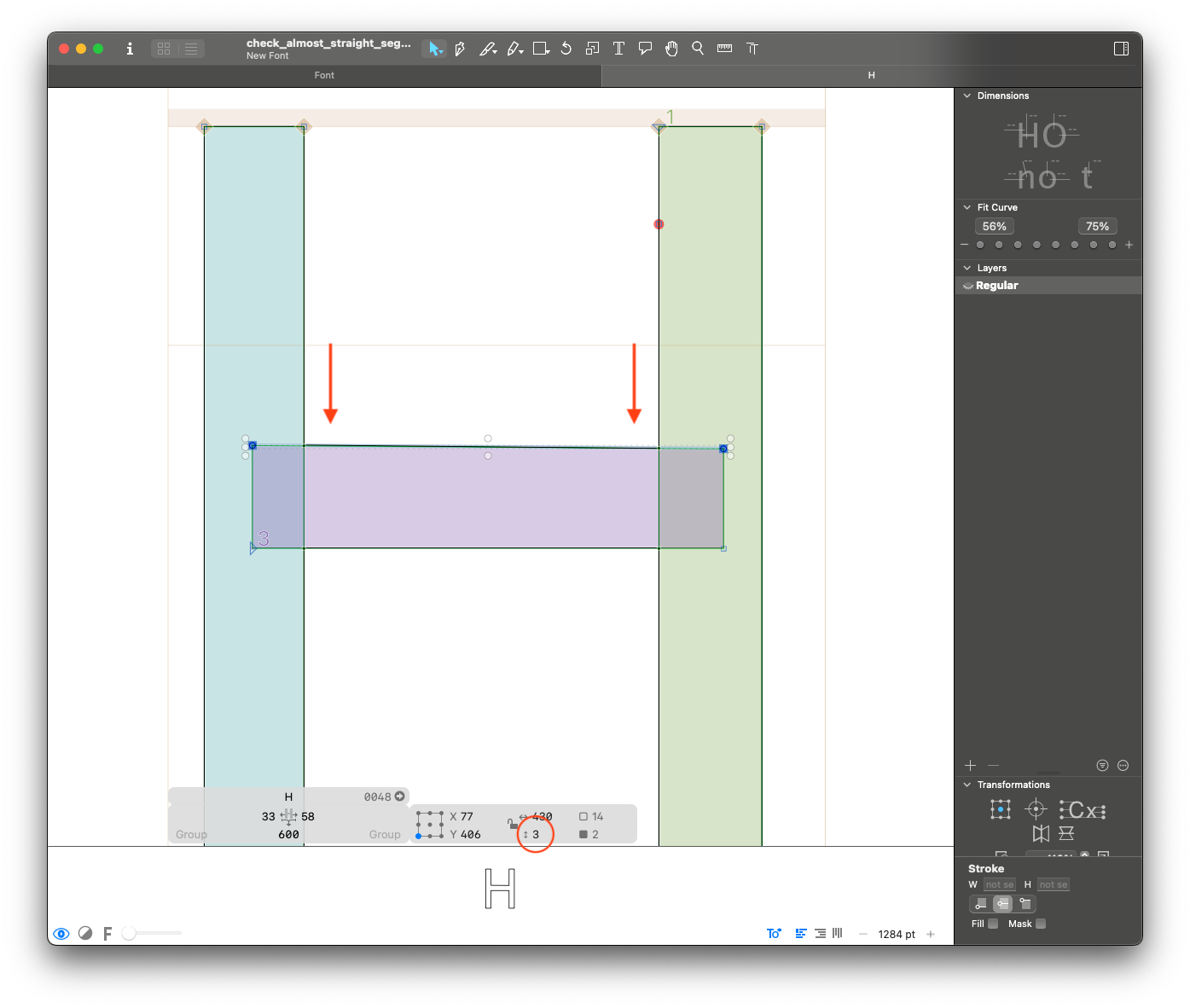
This step checks for segments that are almost straight. A segment is reported if it meets one of the following conditions:
- Its angle is nearly orthogonal to the x- or y-axis (within +/- 4° of 0°, 90°, 180°, or 270°).
- The difference in its x or y coordinates is less than or equal to 4 units.
Why is this a problem:
Almost straight segments tend to be human errors during the design process. They might cause rendering issues or just be not very pretty :)
What to fix:
Make sure segments that should be straight (stems, crossbars, etc) are straight.
What not to fix:
If the reported segment is intentionally not straight, it doesn't need to be changed.
Anchor Height Consistency between Roman and Slant anchors warning
How the check works:
It checks if the y value of each anchor is consistent between roman and slant/italic layers. An anchor is reported if the coordinates are different.
Why is this a problem:
Anchors at different heights tend to be human errors during the design process. They will cause marks to appear at different heights in slant/italic compared to roman.
What to fix:
Ensure that all anchor heights are consistent.
What not to fix:
If your slant or italic layer has any reason to have anchors at different heights, you can keep them. (Ex: if the italic /l has a long exit stroke and therefore needs the /ldot anchor to be higher than in roman)
Anchor to Metrics Alignment anchors error
How the check works:
It checks if top and bottom anchors are aligned to the corresponding alignment zones.
The top anchors that don't align with x-height, ascender or cap height, and bottom anchors that don't align to baseline or descender will be reported.
Why is this a problem:
Anchors at different heights tend to be human errors during the design process. They might cause marks to appear at different heights in different glyphs. Anchors aligned with zones are also easier to manage and visually check.
What to fix:
Make sure all top and bottom anchors sit within an alignment zone.
What not to fix:
Some VERY special cases will sometimes call for anchors to be placed outside metrics, but leave it only to the really necessary situations (Ex: bottom anchor in /ydotbelow).
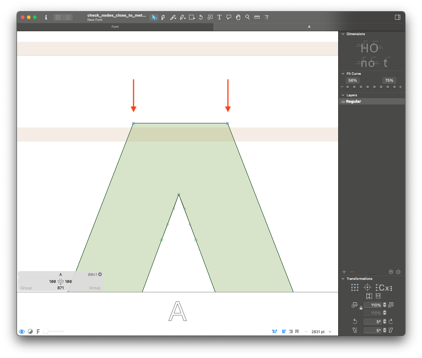
Bounds Close to Metrics outlines warning
How the check works:
It checks if the layer bounds are within 10 units of an alignment zone. It will report layers that have extremes close to an alignment zone, but not in it.
Why is this a problem:
Small misalignments tend to be human errors during the design process, or may mean the alignment zones might be set incorrectly. Extremes outside of alignment zones can cause rendering issues with hinting.
What to fix:
Make sure overshoots and vertices all fit inside the set alignment zones. If only a few glyphs are reported, consider correcting the outlines so that they fit inside the zones. If too many glyphs are reported or if you think you need the overshoots to stay the same size, if might be better to adjust the size of the alignment zones.
What not to fix:
If you think the issue reported should NOT align to the rest of outlines in the zone, you can leave it (Ex: top of the /t or an italic /p stem that are between x-height and cap-height).
Brace Layer Coordinates designspace error
How the check works:
It checks the settings for all brace layers in the font. It will report the following errors:
- If a brace layer shares a design space location with a master.
- If a brace layer is outside of the design space defined by the font masters.
Why is this a problem:
Brace layers with problematic locations will cause interpolation problems and might not allow a font to be generated.
What to fix:
Make sure the brace layers have appropriate locations inside of the design space.
What not to fix:
This must be fixed.
Component Anchor Automatic Alignment components error
How the check works:
If more than one anchor/_anchor pair would match, it's possible set the anchor to use for automatic alignment. We check that if a component is attached to an anchors, it's the same in all layers.
Why is this a problem:
If a component is attached to different anchors in different layers, auto-alignment becomes inconsistent or unpredictable.
What to fix:
Open the Info box for the component in each layer and make sure it’s assigned to the same anchor name everywhere.
What not to fix:
Need to be fixed
Components Scaled Nonproportionally components error
How the check works:
It checks all the components for different x an y scaling coefficients. It will report a component if the coefficients are not equal.
Why is this a problem:
In italic layers, different scaling coefficients will cause angle variation. If the component has straight segments, they will not follow the italic angle anymore.
What to fix:
Please decompose the components in cases with deformations of the italic angle.
What not to fix:
You don't need to fix this issue if:
- Only upright layers of a glyph are reported, or
- The reported component is small and does not have straight segments (Ex: a scaled round /period for /question)
Composite Glyphs without Automatic Alignment components error
How the check works:
For all layers with components, it checks if at least one of them is auto-aligned. It will report layers that don't have at least one auto-aligned component.
Why is this a problem:
Components that are not auto-aligned might move around in undesired ways during spacing and kerning. We need them to be auto-aligned to make sure their position is tied to their sidebearings and/or anchors.
What to fix:
Make sure combining marks (and other components like slashes, circles and bars) are always positioned using anchors, and that base components are auto-aligned if the composite glyph should follow the same metrics.
What not to fix:
The only exception to this rule are glyphs composed by multiple instances of the same component, like /ellipsis or /quotedbl. In these cases, the components can remain unaligned.
Composite Layer with Anchors anchors warning
How the check works:
For all layers with components, it checks whether anchors are present. It reports all layers containing both components and anchors.
Why is this a problem:
Components can shift during spacing and kerning, and anchors won't follow, leading to misalignment. In most cases, if a composite glyph requires anchors, they should be inherited from the base component rather than placed directly in the composite glyph.
What to fix:
Determine whether the composite glyph really requires these anchors. If the anchors are necessary, we recommend moving them to the base glyph.
For example, if /En-cy uses /H as a component and needs a bottomright anchor, move the anchor to /H.
What not to fix:
In rare cases, a composite glyph may require an anchor to be positioned differently from the base glyph. In such instances, the anchor can remain in the composite glyph.
For example, /Ohorn may need the top anchor to be shifted to the left to avoid a clash in /Ohorntilde.
Dinamo Character Set character_set error
How the check works:
It checks if the font covers the Dinamo Retail Character Set™.
Why is this a problem:
All our retail fonts must cover our basic character set.
What to fix:
Please add the missing glyphs and all necessary related alternates.
What not to fix:
This must be fixed.
Ghost Hints hinting warning
How the check works:
It checks if there is layer with hints
Why is this a problem:
Manual hints are most of the time not set intentionally, and they can cause problems with the hinting process.
What to fix:
Please remove all manual hints from the layers.
What not to fix:
Exception: if the font have been manually hinted.
Greek Letters Used as Math Symbols character_set error
How the check works:
For fonts that don't support Greek, it checks if the glyphs Delta and mu are present.
Why is this a problem:
Other code points are available for use as math symbols, while Greek code points should be reserved exclusively for the Greek script. Including Delta and mu as math symbols can cause issues when a fallback font is needed for Greek text.
What to fix:
If the font doesn't support Greek, please rename Delta -> increment and mu -> micro if they represent math symbols.
What not to fix:
This must be fixed.
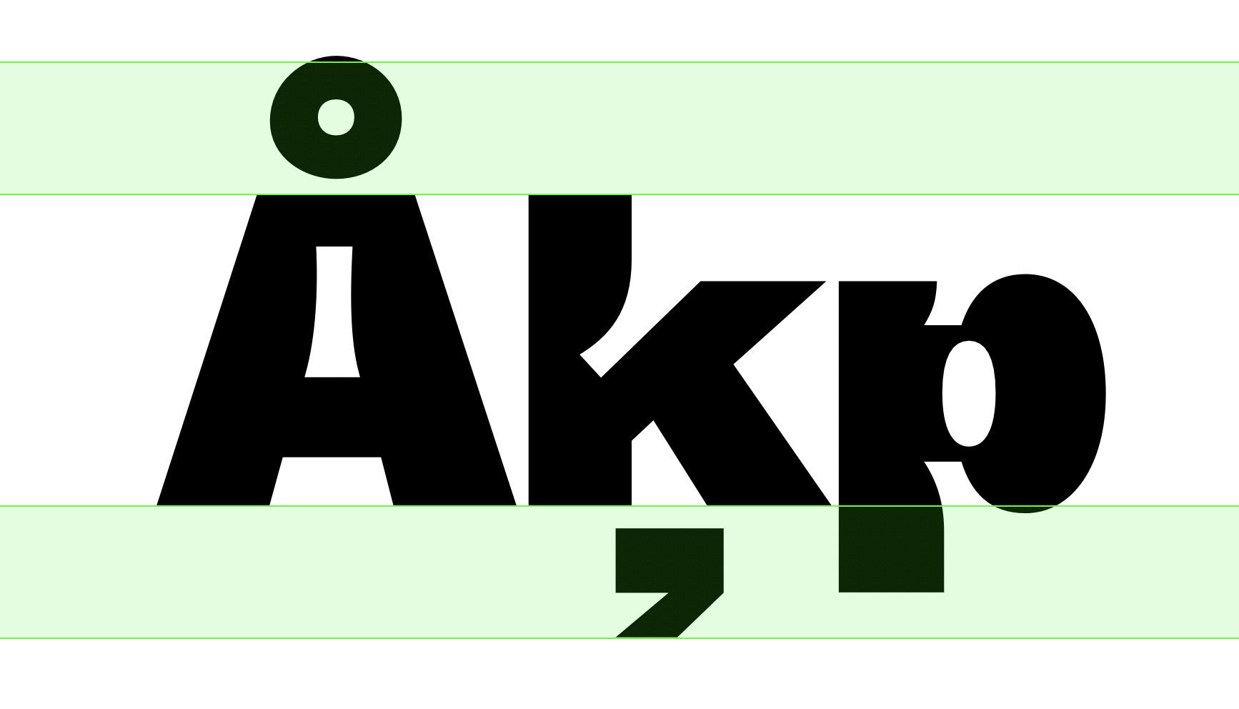
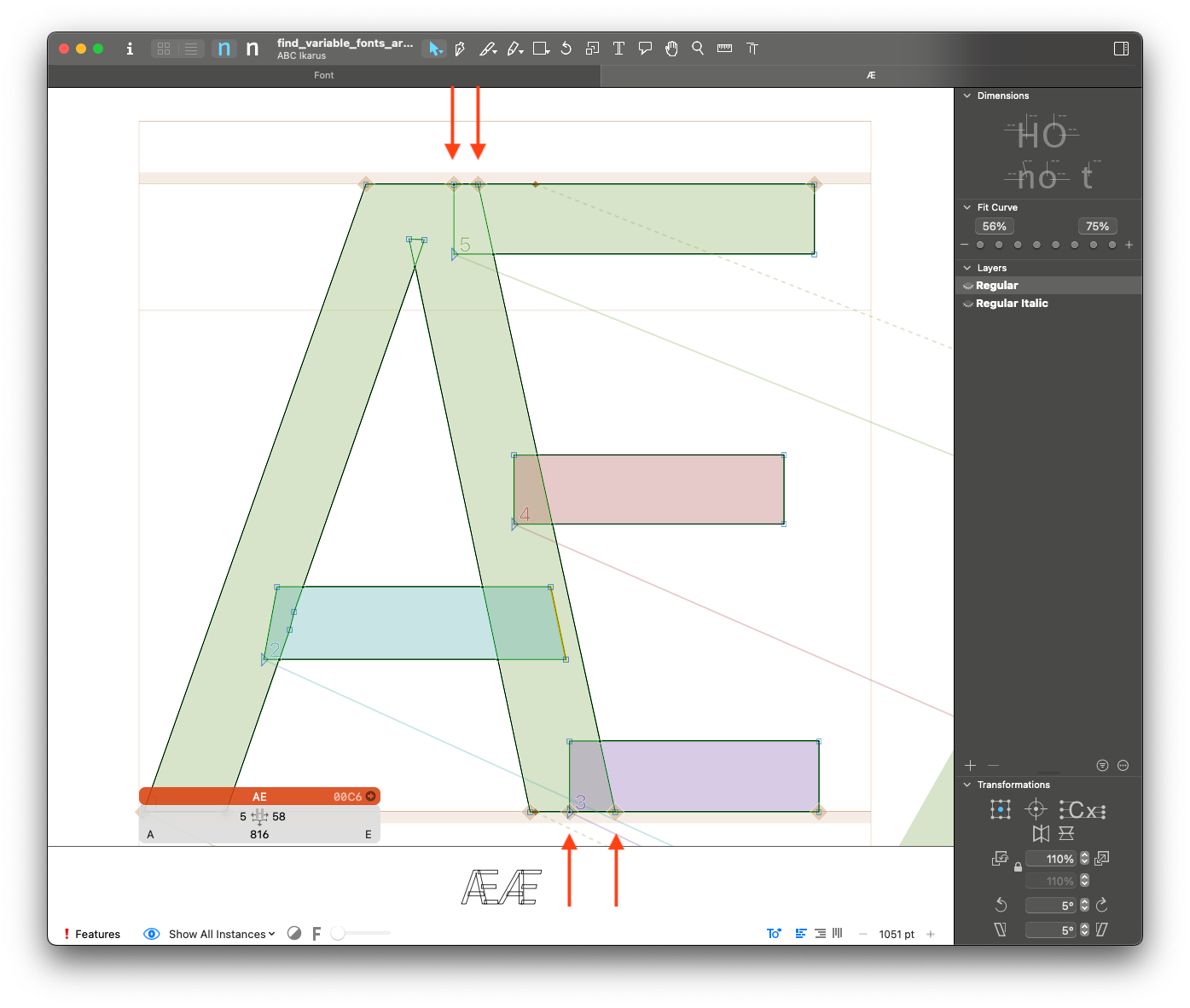
Height Outliers Top and Bottom outlines warning
How the check works:
It checks if the top and bottom extremes of layers are within a reasonable distance to the ascender and descender metrics. It will report layers that exceed "safety boundaries" arbitrarily defined based on descender and ascender length. Note: glyphs with stacked accents are excluded from this check.
Details: The length of the "safety boundaries" is arbitrarily defined for the purpose of this check as 30% of the distance between the ascender and the descender. Refer to the image below for an example of the safety boundaries. They should be used as a "ballpark" value, not as exact measurements.
Why is this a problem:
Glyphs with top and bottom bounds that exceed the average of the font will require the vertical metrics to be set larger than necessary. They may also cause collisions when set with a tighter leading. Example: if /commaaccent is too much taller than /cedilla and /dotbelow, the descender metrics need to be set larger than necessary.
What to fix:
Make sure the commonly problematic Glyphs (like /commaaccent and /ring) are designed compact enough so that they don't stick out of the safety boundaries.
What not to fix:
The "safety boundaries" is an automatic reference and might not provide an accurate reference for all fonts. If you think it is too strict/too loose, please get in touch with us :)
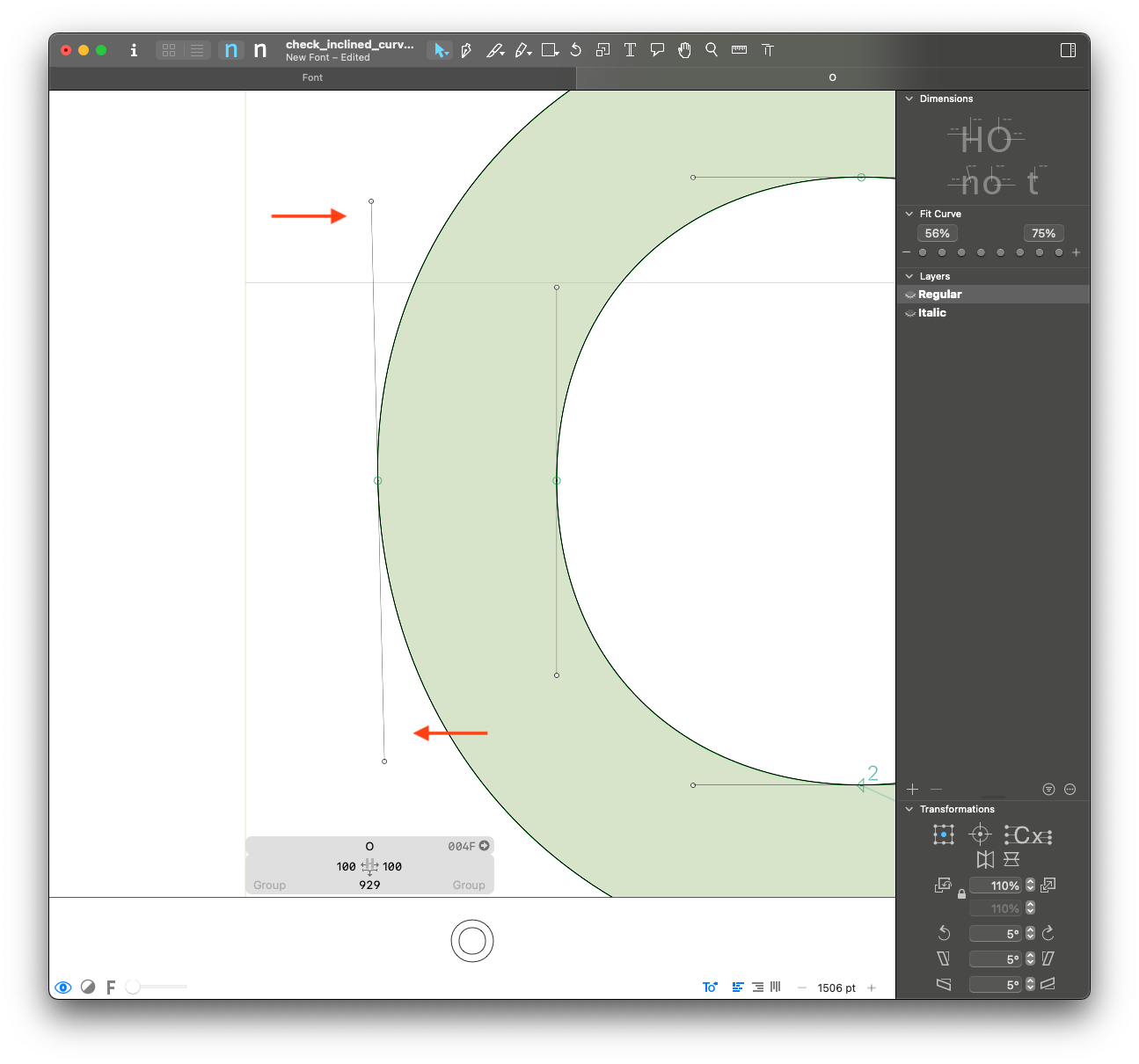
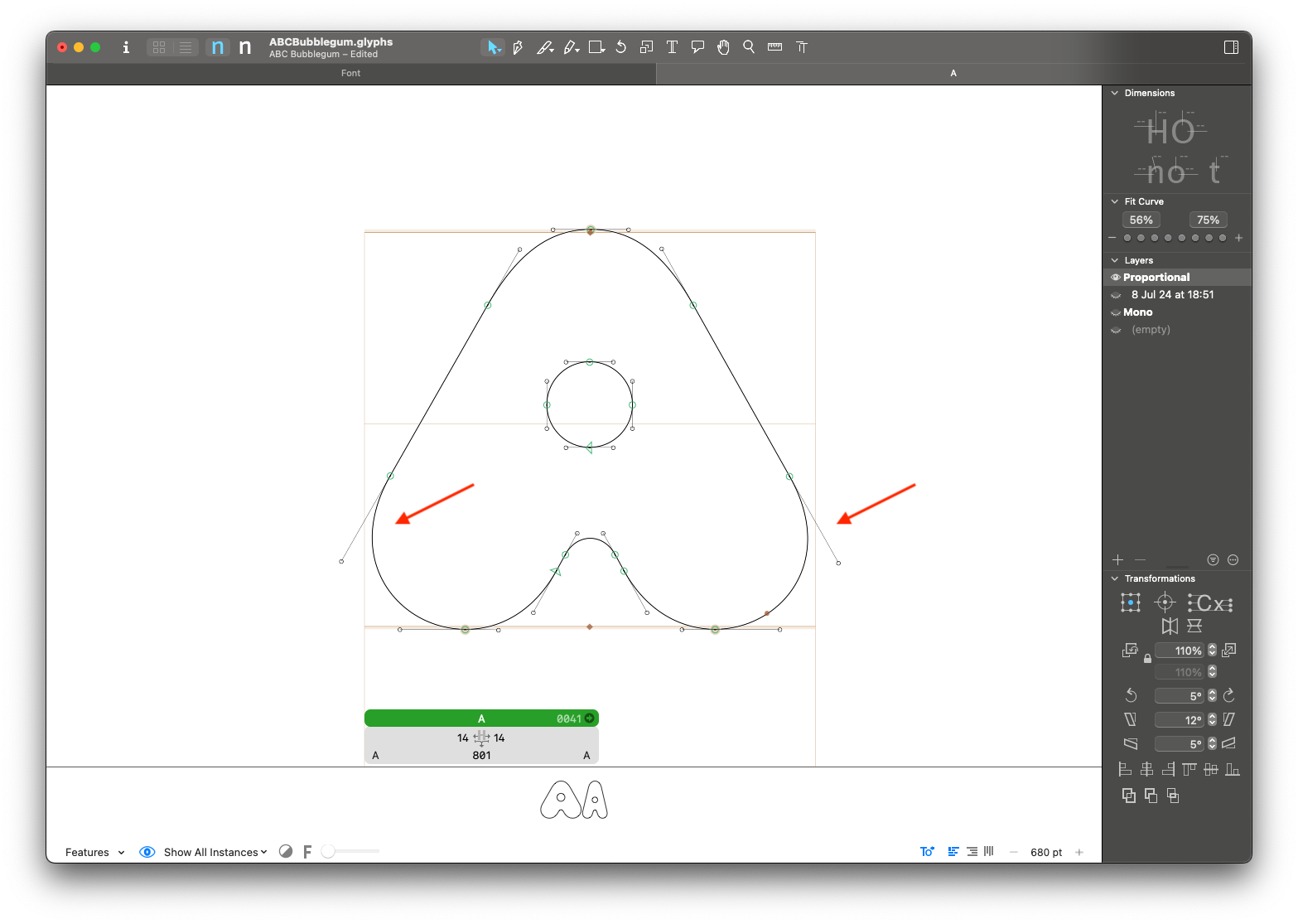
Inclined Curve Nodes outlines warning
How the check works:
For on-curve points with 2 handles, it checks if the angle of the handles is slightly off from the vertical or horizontal. For italic or slanted masters, it will use the italic angle as a reference instead of the vertical. Nodes will be reported if they are off, but within 5° of the reference angles. This check won't report greater differences to avoid false positives.
Why is this a problem:
Handles that are slightly inclined tend to be human errors during the design process. They might lead to interpolation and hinting problems.
What to fix:
Please make sure there are no accidentally inclined handles, and that they are either horizontal or vertical (or follow the italic angle) when possible.
What not to fix:
You might not want to fix this if:
- Adding points to the extremes will prevent the curve from looking good. This might happen if the rounding is too small or if the curve needs to have a particular shape that is hard to achieve.
Instance Names font_info error
How the check works:
It checks the Style Name attribute of all instances. It will report any instances that have names that don't fit the model: {weight} + Italic ({weight} + Slanted is also accepted).
Why is this a problem:
Anything other than {weight} + Italic should be in the Localized Family Name attribute. This makes sure all families follow the same structure and avoids bugs in MS Office.
What to fix:
Please rename the styles to follow {weight} + Italic model. For example, the setup for "ABC Diatype Condensed Regular Italic" should be:
Style Nameshould be "Regular Italic" andLocalized Family Nameshould be "ABC Diatype Condensed"
What not to fix:
In VERY special cases, there might be a need for style names to be different. Ex: "ABC Synt Bold Turbo".
Interpolation Compatibility interpolation error
How the check works:
It checks glyphs compatibility across the design space using fontTools.varlib interpolation checker.
Why is this a problem:
Interpolation issues won't allow intermediate instances and variable fonts to be exported.
What to fix:
Please fix compatibility for all glyphs. If an alternate construction is needed in a specific part of the design space, add an alternate glyph (.rlig).
What not to fix:
This must be fixed.
Interpolation Quality interpolation warning
How the check works:
It checks glyphs outline quality for interpolation across the design space using fontTools.varlib interpolation checker.
Why is this a problem:
This check helps finding human errors during the design process. It will highlight things like wrong starting points, flipping shapes, and kinks.
What to fix:
Make sure all glyphs are interpolating smoothly and there are no visible kinks in any instances.
What not to fix:
There might be false positives depending on the design. Feel free to disregard the warnings if the interpolations look good to you.
Layer Bounds vs Extreme Nodes Left and Right outlines warning
How the check works:
It checks if there are points on the top and bottom extremes of a layer. It will report all cases beyond an arbitrary 12upm tolerance.
Why is this a problem:
Missing extremes may cause hinting and interpolation problems.
What to fix:
Please add extreme points whenever possible.
What not to fix:
You might not want to fix this if:
- Adding points to the extremes will prevent the curve from looking good. This might happen if the rounding is too small or if the curve needs to have a particular shape that is hard to achieve.
Layer Bounds vs Extreme Nodes Top and Bottom outlines warning
How the check works:
It checks if there are points on the left and right extremes of a layer. It will report all cases beyond an arbitrary 12upm tolerance. Please note there might be a lot of false positives in slanted/italic masters.
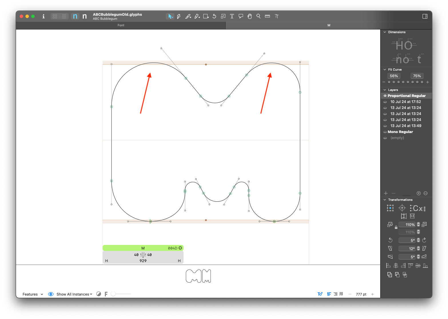
Why is this a problem:
Missing extremes may cause hinting and interpolation problems.
What to fix:
Please add extreme points whenever possible.
What not to fix:
You might not want to fix this if:
- The layer is slanted/italic and you want or need to keep the handles angled.
- Adding points to the extremes will prevent the curve from looking good. This might happen if the rounding is too small or if the curve needs to have a particular shape that is hard to achieve.
Legacy Accents as Components components error
How the check works:
It checks if legacy accents are used as components. It will report all accented glyphs not built with combining marks.
Details: Legacy accents have their
categoryset toMarkandsubCategoryset toSpacing. If a layer includes a component with these attributes, it indicates the use of a legacy accent.
Why is this a problem:
Combining marks should always be used to build composite glyphs.
What to fix:
Please make sure all composite glyphs are built using combining marks.
What not to fix:
This must be fixed.
Math Widths metrics warning
How the check works:
It checks if all math symbols share the same width. For each master, the most common width among math glyphs is used as reference. All the layers that differ from this reference width will be reported.
Why is this a problem:
Math symbols commonly share the same width (and the same width as the tabular numerals) for simplicity, and to avoid having to add tabular versions of each of them.
What to fix:
If you meant to draw all your math symbols at the same width, please check that they are consistent.
What not to fix:
If your math symbols call for specific design adjustments that would prevent them from having the same width, you can ignore this check.
Missing Alternative Glyphs character_set error
How the check works:
Checks if the required alternates are available for all composite glyphs in the font.
For example: if there is a glyph called a.ss01, the check will verify the presence of corresponding glyphs such as aacute.ss01, agrave.ss01, and so on.
Details: This check also goes a step further by checking multiple combinations. For example, if
k.ss01andcommaaccentcomb.ss03exist, it will check for the presence ofkcommaaccent.ss01,kcommaaccent.ss03andkcommaaccent.ss01.ss03.
This check is still not bulletproof, since it's dependent on the nature of the glyphs involved. Be aware that there might be some unreported issues, and make sure to check manually for those.
Why is this a problem:
Missing alternate glyphs will lead to the wrong rendering of stylistic sets.
What to fix:
Please make sure that all necessary alternate glyphs are present for all OpenType features.
What not to fix:
This must be fixed. There might be some false positives that don't make sense, please review the reports with care.
Missing Upper Lower Variants character_set error
How the check works:
It checks whether any lowercase glyph is missing its corresponding uppercase pair, and vice versa. If one of them is missing, the pair will be reported.
This is partially redundant with the "Dinamo Glyphset" check, but this is more generic and works outside that predefined set of glyphs. The check is based on data from GlyphData.xml.
Why is this a problem:
Missing uppercase/lowercase pairs will cause problems when changing text case.
What to fix:
Please add all missing glyphs.
What not to fix:
This must be fixed.
Mixed Components and Outlines components error
How the check works:
It checks for layers with both components and outlines. It will report a layer if it has at least one component and at least one outline.
Why is this a problem:
Components might move around in undesired ways during spacing and kerning. We need to use either only outlines or only auto-aligned components to ensure that the alignment of elements remains consistent, even if the component's sidebearings are changed.
What to fix:
There are two options to fix these issues:
- Use Components and Anchors (Highly Recommended). We highly recommend converting outlines into components and setting anchors to enable auto-alignment.
- Keep Only Outlines (If Necessary). Only if using components is absolutely not feasible, you can decompose the components and retain only the outlines.
What not to fix:
This must be fixed.
Mono Widths metrics error
How the check works:
It checks the widths of all glyphs in monospaced masters. It will report all glyphs that have a different width from the reference glyph: zero.
Details: this check will consider monospaced all masters with
Monoin the name, independent ofMONOaxis coordinates.
Why is this a problem:
True monospaced fonts must have the same width for all glyphs. Most of Dinamo's monospaced fonts have exceptions, but they should be restricted to ligatures and other special cases.
What to fix:
Please make sure all glyphs have the same width. If exceptions need to be made, their width must be a multiple of the reference width (double or triple the width).
What not to fix:
This must be fixed.
Node Height Consistency between Roman and Slant outlines warning
How the check works:
For upright-slant layer pairs, it checks if the y coordinate of points is the same. It will report nodes that have different y coordinates in upright-slant layer pairs.
This check will only look at points with the same y coordinate as the previous and next nodes. That means either horizontal segments or top extremes of curves.
Why is this a problem:
Horizontal segments or curve extremes at different heights can oftem be human errors during the design process.
What to fix:
Please make sure all the alignment differences are intentional.
What not to fix:
This is an arbitrary rule that might not make sense for every design. Feel free to ignore the reports that don't apply to the design.
OpenType Features Out of Sync opentype_features error
How the check works:
We extract the features code from the .glyphs file (including the GlyphsApp custom syntax),
and then we parse it with a fontTools parser object. If an error occurs, the error messages
are collected and added to the reports.
Why is this a problem:
If OpenType features fail to compile, binary fonts cannot be generated.
What to fix:
Review the features to identify the issue, using the error messages as guidance. If needed, contact the engineering team for assistance. To ensure everything is working correctly, attempt to compile some binaries from Glyphs.
What not to fix:
This issue must be fixed.
Outline Width Consistency between Roman and Slant outlines warning
How the check works:
It checks the outline width consistency between upright and slanted layers. If the relation between two layers differs too much from their reference value, they will be reported. More extreme cases will also be flagged as critical.
Details: First, we collect the outline width ratio for the characters
A–Zanda–z, and store the median value as a reference for the layer pair. Then, we compare the widths for the entire font (Roman vs. Slant counterparts). If the width ratio is outside of the reference range (5% tolerance), it is flagged. Differences over 7% are considered critical.
Why is this a problem:
Large differences tend to be human errors during the design process. Sometimes we might forget to adjust the contours after slanting, or forget to replicate adjustments in the upright to the corresponding italic layer.
What to fix:
Make sure the slant/italic masters have an adequate ratio to the upright design.
What not to fix:
If you think the reported layers look good, and the proportion difference is intentional and consistent for the design, you can leave it.
Oversized Combining Marks outlines warning
⚠️ THIS CHECK IS IN EXPERIMENTAL. YOU DON’T NEED TO FIX IT, WE ARE JUST TESTING IT. (anyway, we'd love to hear your feedback)
How the check works:
This check evaluates the vertical alignment of combining accents in each master. It calculates the mid-point (y-center) of each marks and compares these values against the average position for that master. Accents that deviate significantly from the average are flagged as potential issues.
Why is this a problem:
In some cases—most notably with the comma accent—the combining mark may retain the proportions of a standard comma rather than being adjusted for its role as a combining accent.
What to fix:
Adjust their size so that they align more consistently with other marks. The goal is to ensure that all combining accents maintain a uniform, visually balanced appearance.
What not to fix:
Do not alter the combining accents if the current size or position is an intentional design decision. Only unintended misalignments should be corrected.
Path Area Consistency between Roman and Slant outlines warning
How the check works:
It checks the path area relations between upright and slanted layers. If the relation between two layers differs too much from their reference value, they will be reported. More extreme cases will also be flagged as critical.
Details: First, we collect the path area relation for the characters
A–Zanda–z, and store the median value as a reference for the layer pair. Then, we compare the path areas for the entire font (Roman vs. Slant counterparts). If the path area relation is outside of the reference range (5% tolerance), it is flagged. Differences over 7% are considered critical.
Why is this a problem:
The cause for path area differences might be a weight difference or a width difference. Large differences tend to be human errors during the design process. Sometimes we might forget to adjust the contours after slanting, or forget to replicate adjustments in the upright to the corresponding italic layer.
What to fix:
Make sure the slant/italic masters have an adequate relation to the upright design.
What not to fix:
If you think the reported layers look good, and the proportion/weight difference is intentional and consistent for the design, you can leave it.
Rotated Components components warning
How the check works:
It checks the rotation of all components. It will report any components with rotation angles not multiples of 45 degrees.
Why is this a problem:
There are very few use cases for components with non-orthogonal rotation angles. These tend to be human errors during the design process.
What to fix:
Please make sure all component rotations are intentional and consistent.
What not to fix:
If the rotation is intentional and consistent with the design, this doesn't need to be fixed.
Short Segments outlines warning
How the check works:
It decomposes and removes overlaps in all layers and checks for short segments. It will report all segments shorter than 10 upm, except if they follow the same direction as an adjascent curve or segment.
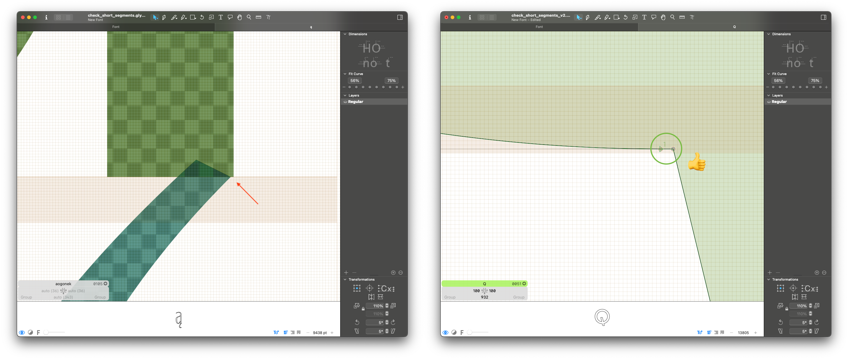
Why is this a problem:
Short segments tend to be human errors during the design process. They are usually the result of misaligned components or interpolation kinks.
What to fix:
Please fix outlines and component placement to make sure there are no kinks or misalignments.
What not to fix:
A short segment doesn't need to be fixed if it is intentional and part of the design.
Slanted Components components error
How the check works:
It checks all layers for slant components. I will report all components with a slant (also skew) angle different from zero.
Why is this a problem:
Slanted components can cause all kinds of interpolation problems, especially in variable fonts.
What to fix:
Please make sure no components are slanted. If you need to adjust their angle, you can decompose it or make an alternate component.
What not to fix:
This must be fixed.
Small Figures components warning
How the check works:
It checks if small figures are build from .dnom components. This includes inferior, superior and .numr glyphs.
Why is this a problem:
Since denominators sit at the baseline, building all the small figures from dnom is more practical and allows for easier component management and less unexpected mistakes.
What to fix:
If the small figures are built from inferior, superior or numr, please change them to use dnom. If they are decomposed, check if it's possible to build them with components.
You can use Build Small Figures script from mekkablue to fix it.
What not to fix:
If inferior and superior have a different design or different size from the denominators, you can build them with other components.
Stacked Points outlines warning
How the check works:
It checks if two consecutive points have the same coordinates. It will report all consecutive points that are stacked (on top of each other).
Why is this a problem:
Stacked points might be human errors during the design process. They also need special attention to produce smooth interpolations.
What to fix:
Check if the stacked points are needed for interpolation, and if the current setup yields smooth and good-looking interpolations.
What not to fix:
If the points are necessary for interpolation and interpolate well, nothing needs to be fixed.
Stems for Autohinting font_info error
How the check works:
It checks if the stems are correctly set for all masters. It will report a master if one of its stems is zero, or if it has less than 4 stems defined.
Why is this a problem:
Vertical and horizontal stems need to be configured to optimize PostScript AutoHinting.
What to fix:
Please set vertical and horizontal stems for each master. In most cases, 2 vertical stems and 2 horizontal stems should be set. More information on how to define their values here.
What not to fix:
This must be fixed.
Stylistic Set Names opentype_features error
How the check works:
It checks if all stylistic sets have a name set. It will report all stylistic sets without a name.
Why is this a problem:
We always want to have descriptive names for stylistic sets for a better user experience.
What to fix:
Please name all stylistic sets.
Simple substitution sets are often named "Alt a" or "Alt I, i, j, l". For more complex substitutions, try to add a descriptive name such as "Straight Terminals", "Cursive Italics", and so on. Avoid using "&" in the names since it causes problems in InDesign.
What not to fix:
This must be fixed.
Tabular Widths metrics error
How the check works:
It checks the widths of all tabular glyphs. It will report all glyphs that have a different width from the reference glyph: zero.tf.
Details: this check will consider tabular all glyphs with the suffixes
.tf,.tosfor.tabular. If you are using other suffixes, consider changing them, as they will not be checked.
Why is this a problem:
All tabular glyphs must have the same width.
What to fix:
Please make sure all tabular glyphs have the same width.
What not to fix:
This must be fixed.
Unclear Glyph Name Suffixes character_set error
⚠ Leave renaming glyphs for the end of the QA process, otherwise the glyphs reported in other checks won't be found. It that happens, all checks must be re-run
How the check works:
It checks if the suffixes used in all glyphs are clear. It will report all suffixes not present in the list of accepted suffixes below:
Public suffixes from GlyphsApp:
tfosftosfscblackCircledcircledcapnarrowsmall
Other cases that are allowed:
- glyph names included in the GlyphsApp language database (like
caroncomb.alt) - suffixes pointing to glyph names, like
caroncomb.tcaron. - suffixes matching OpenType features, like
ss01orrlig. loclXXXsuffixes for glyphs covering specific local variants, likeperiodcentered.loclCAT.
Why is this a problem:
Glyphs with unclear suffixes might not get automatically added to their respective features. Besides that, descriptive glyph names make collaboration between multiple designers and file handovers easier.
What to fix:
Please make sure to only use glyph suffixes that are present in the list of accepted suffixes above.
What not to fix:
This must be fixed.
Unconventional Anchors anchors error
How the check works:
It checks anchor names and compares them to the expected anchors for each glyph. It will report all anchor names that are not expected.
Details: the list of expected anchor names for each glyph is stored in the
GlyphData.xmldatabase. Anchors named 'bar' and 'center' are skipped.
Why is this a problem:
Anchors with unconventional names may cause issues when building composite glyphs in GlyphsApp.
What to fix:
Please ensure that all necessary anchors are correctly named and that there are no unnecessary anchors in any glyph.
What not to fix:
If you need additional anchors to position non-standard components, you can keep the unusual anchors.
Example: 'center' anchor in '.dnom' glyphs for circled numerals, 'ldot' anchor in /L and /l.
Unnecessary Tabular Glyphs character_set error
How the check works:
It checks if the font has unnecessary tabular alternate glyphs. It will report the following glyph names:
space.tfperiod.tfcomma.tfcolon.tfsemicolon.tfperiodcentered.tfasterisk.tfslash.tfhyphen.tfendash.tfemdash.tfparenleft.tfparenright.tf
Why is this a problem:
Tabular alternates should be restricted to glyphs which are used with tabular numerals. Currencies and math symbols are accepted, but tabular punctuation will lead to irregular spacing when the tnum feature is activated.
What to fix:
Please remove all the reported glyphs.
What not to fix:
This must be fixed.
Unslanted Layers outlines warning
How the check works:
It checks if italic/slant masters have the same outlines as their upright counterparts. It will report pairs of layers that have identical outlines. The check is based on the assumption that slanting can happen only "forward" (with negative angle). In case of a backslanted project, this check might output weird results.
Why is this a problem:
Identical outlines for upright and italic masters tend to be human errors during the design process.
What to fix:
Please make sure all italic/slanted layers also have italic/slanted designs. Math symbols must also be slanted
What not to fix:
There are a few exception glyphs (Ex: arrows or graphical symbols), that can share the same design for upright and italic.
Variable Font Artifacts interpolation error
How the check works:
It checks all layers for perfectly overlapping segments. It will report any two segments if their intersection forms a line.
Why is this a problem:
Paths that overlap in this way cause rendering artifacts in variable fonts. These artifacts are darker portions of the letter where segments overlap.
What to fix:
Make sure there are no perfectly overlapping paths. The solution is often removing overlaps and using less paths.
What not to fix:
This must be fixed.